
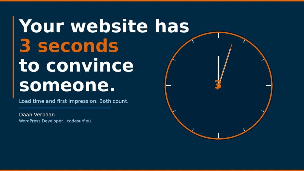
Three seconds. That is all you have.
Not to convince someone of your offer, not to tell your whole story. Just to prevent them from clicking away before they have seen anything at all.
Those three seconds consist of two moments that both need to go right. First your site needs to load. Then what appears needs to be immediately clear. Get either of those wrong and you have lost the visitor.
Moment 1: the site needs to load
This sounds obvious but the reality is that many websites already fail here. Google uses as a benchmark that a page should be visible within 2.5 seconds on mobile. Not fully loaded, but visible enough to start reading.
What can go wrong: images that are not optimised, too many plugins loading scripts, a slow server, or a theme that loads far more than necessary. These are not obscure technical problems. They occur on most WordPress websites that are not actively maintained.
The impact is directly measurable. A one second delay can reduce conversion by 7%. For a webshop that means fewer orders. For a service provider fewer contact requests. The visitor may not even consciously notice but they are already gone.
You can test your own load time for free via Google PageSpeed Insights at pagespeed.web.dev. Enter your URL and you immediately see where things go wrong and what the impact is.
Moment 2: the first impression needs to work
Suppose your site loads quickly. Then the real work begins. Because what does the visitor see first? And do they understand within three seconds that they are in the right place?
Most people do not scroll immediately. They first look at what is above the fold, the part that is visible without scrolling. If that part does not speak to them they do not scroll further. They leave.
What works: a clear heading that tells in one sentence what you do and for whom. Not a slogan, not an abstract promise. Just a clear description. “Custom WordPress websites for businesses that want more than a standard solution” works better than “We build digital dreams”.
What does not work: a large image without text, an intro video that plays automatically, or a homepage that starts with the company story instead of the value for the visitor.
The combination that makes the difference
Load time and first impression are not separate problems. They reinforce each other. A site that loads quickly but has an unclear message loses visitors in the second phase. A site with a strong message but a slow load time loses them in the first.
Both need to work. And both are fixable.
For load time: optimise your images, limit the number of plugins, choose a fast hosting environment and make sure your theme does not load unnecessary code. If you are using WordPress without a page builder you already have a head start.
For first impression: look at your homepage through the eyes of someone who does not know you yet. Do you understand within five seconds what you can get here? Is there a clear next step? Is there something that invites you to keep reading?
What you can do today
Go to pagespeed.web.dev and test your homepage. Look at the score on mobile, because that is where the majority of your visitors come from. Take the red and orange flags seriously.
Then open your own homepage on your phone. Not logged in, not in the editor. Just as a visitor. What do you see first? Do you immediately understand what you can get here? Is there something that invites you to continue?
If the answer to those last two questions is no, you know where to start.
Let Codesurf take a look
Want to know how your website scores on load time and first impression? We are happy to take a look, no strings attached. A quick analysis, concrete findings and honest advice on what could be better.
Get in touch or take a look at our maintenance plans if you would like us to keep your site in shape on an ongoing basis.